From: Ukraine
Location: Kremenchuk, UA
On Useme since 17 July 2022
About me
Experienced, energised, creative. I love my job. It is enough to make anything that you can imagine.
My Specializations: ✔Web design ✔UX/UI design ✔E-commerce ✔Graphic design ✔Mobile App Design ✔Logo design
Tools: 🔸Figma 🔸Adobe Photoshop 🔸Adobe Illustrator
I have a positive attitude to work, quality results through coordination all questions and ease of communication. There are no unsolvable problems.
I'll be happy to discuss your project and offer profitable options!
Portfolio
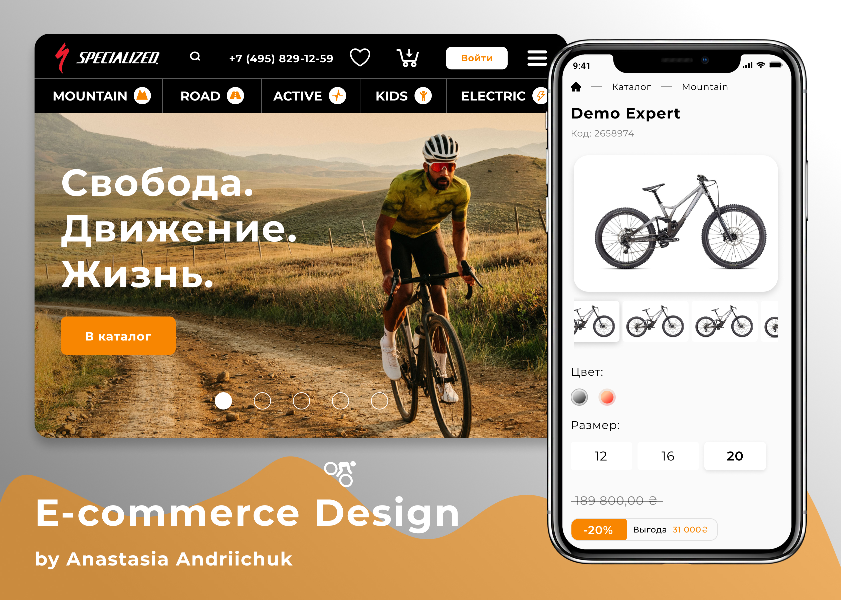
E-commerce Website
The main goal of this project was to create unique and convenience e-commerce design for brand of bicycles Specialized. E-commerce design consists of 10 full pages and several popups. I made an accent on orange color, as it symbolizes the energy!

E-commerce Website
The main goal of this project was to create unique and convenience e-commerce design for brand of bicycles Specialized. E-commerce design consists of 10 full pages and several popups. I made an accent on orange color, as it symbolizes the energy!
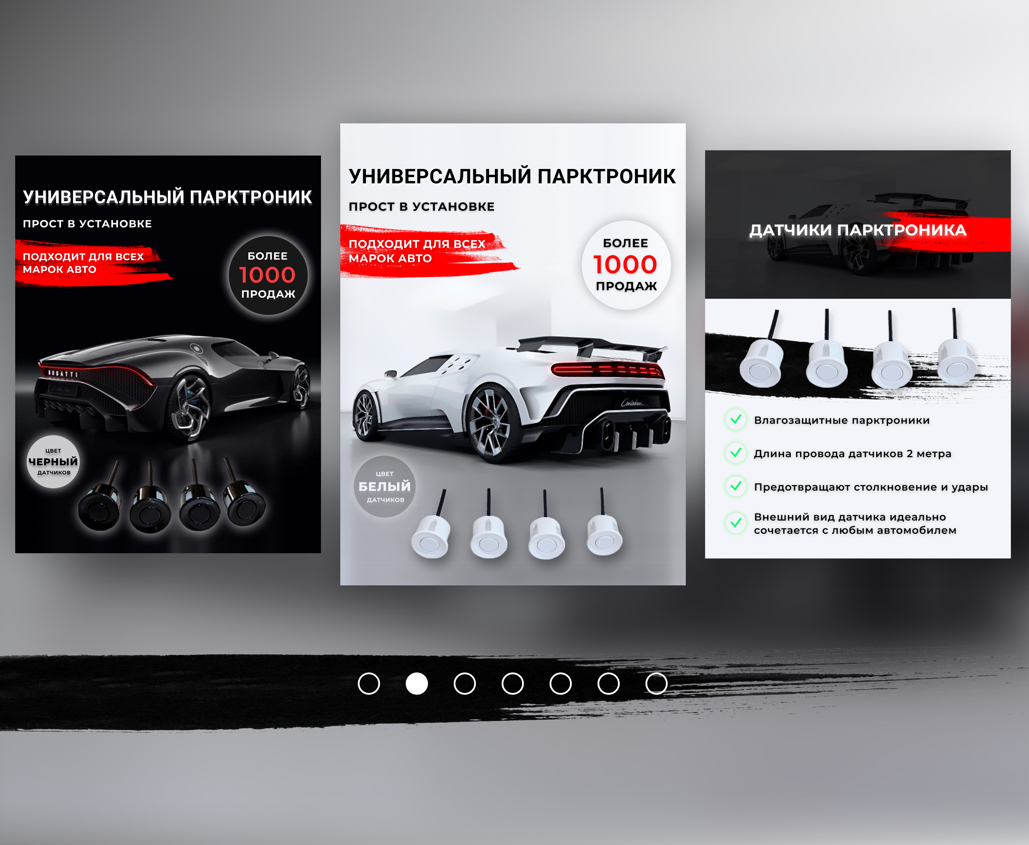
Product cards
I designed product cards for a client who sells parking sensors.
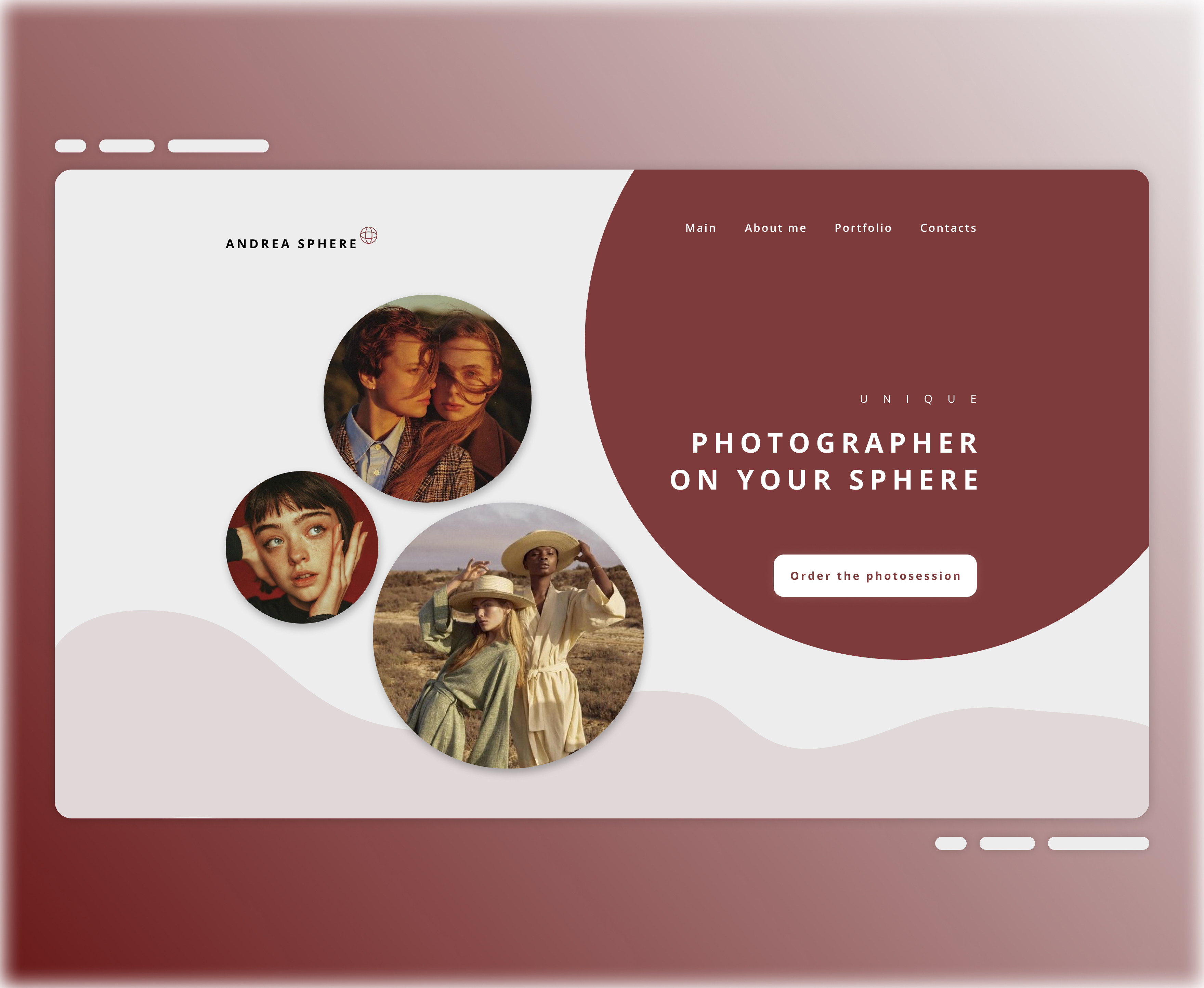
Landing page for photographer
I made Landing Page desigh for photographer. The idea of this project is to show word and design pun. Photographer's pseudonym fits the shapes. I chose shades of burgundy and gray colours for the design to emphasize the richness and contrast.

Landing page for photographer
I made Landing Page desigh for photographer. The idea of this project is to show word and design pun. Photographer's pseudonym fits the shapes. I chose shades of burgundy and gray colours for the design to emphasize the richness and contrast.
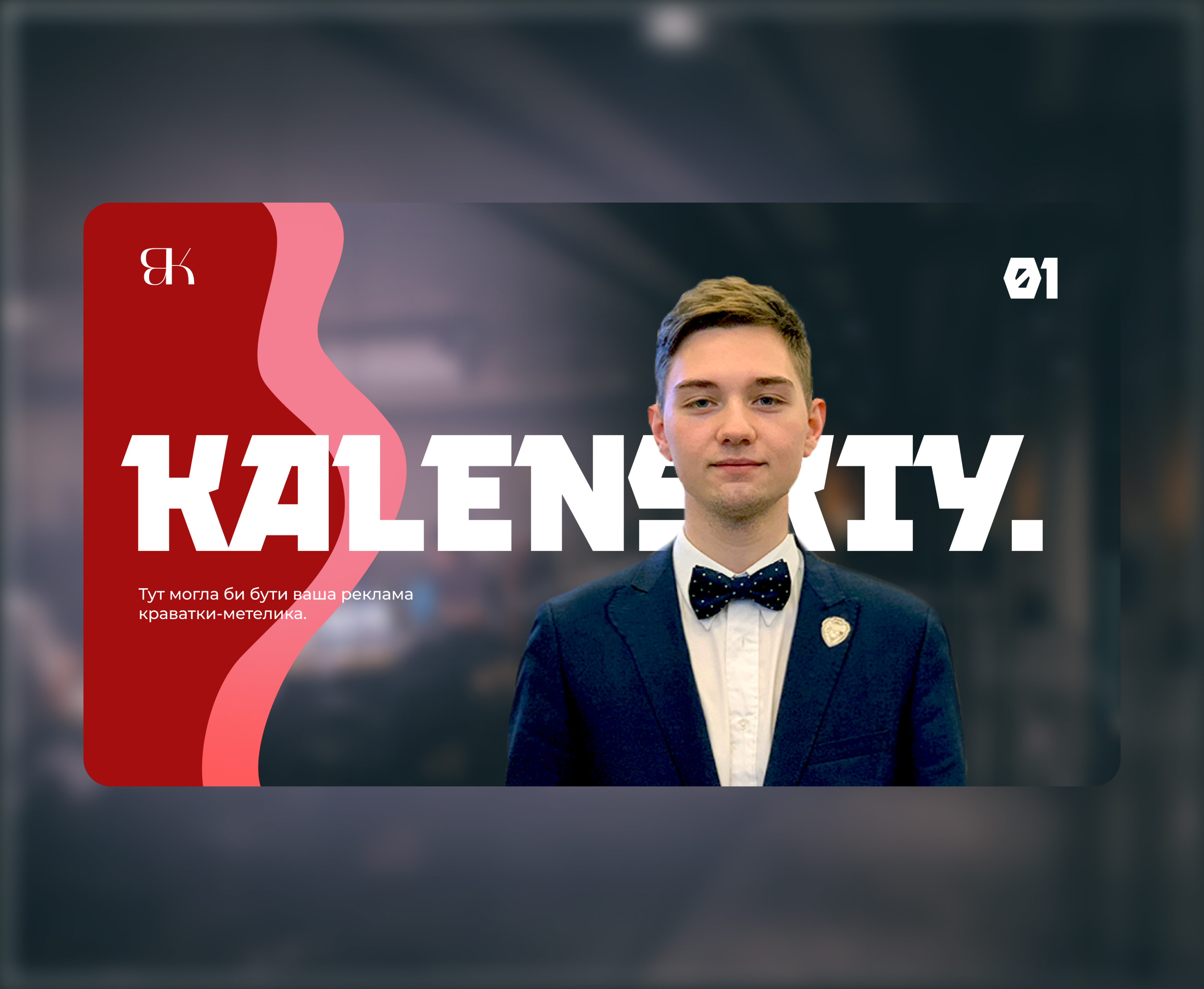
Election banner
I created a banner for a candidate for the election of the head of the student parliament of our university. The purpose of the banner was to introduce candidate to the students and to show his prestige.

Election banner
I created a banner for a candidate for the election of the head of the student parliament of our university. The purpose of the banner was to introduce candidate to the students and to show his prestige.
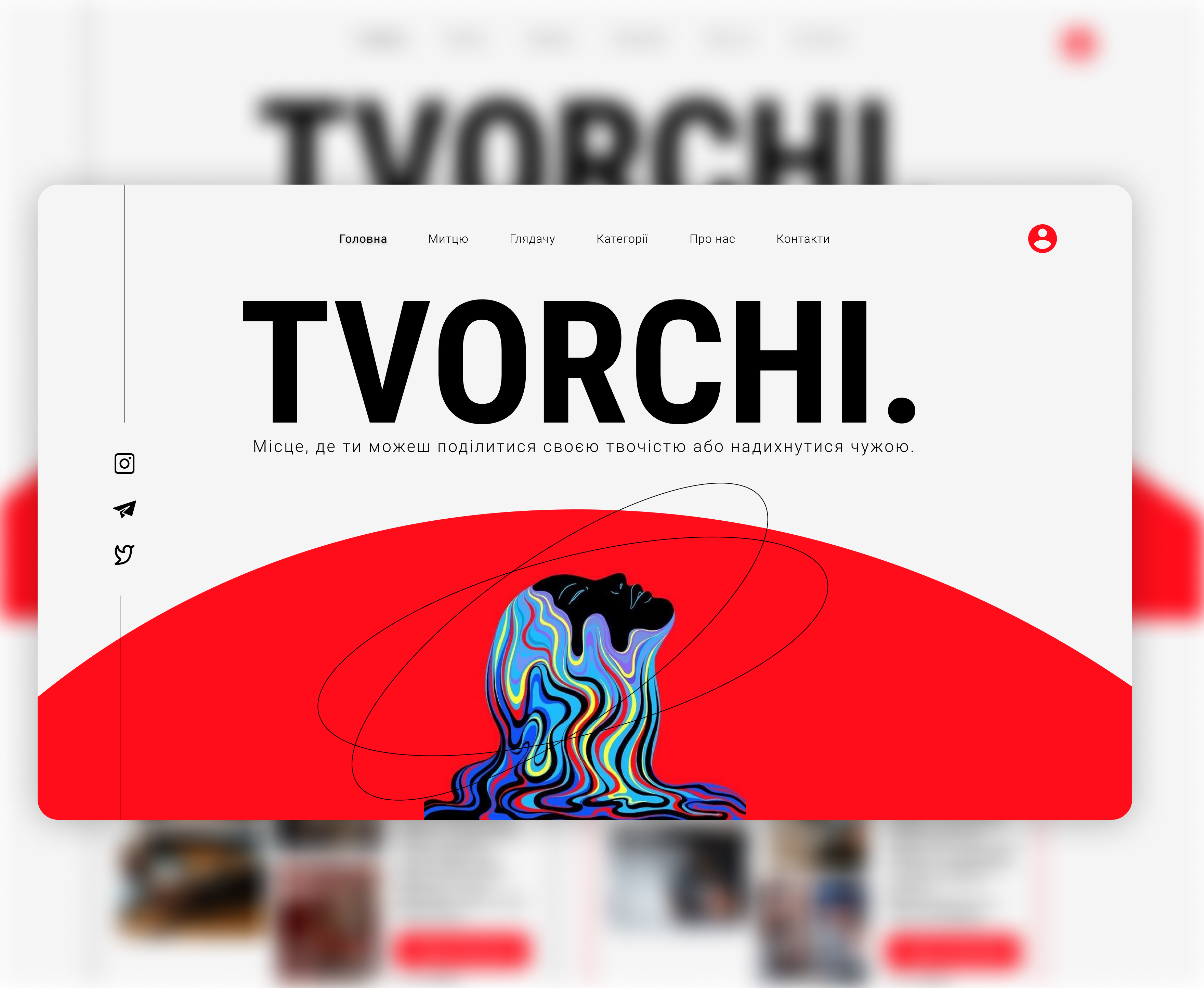
Landing page
I created design for Landing Page for the creative project of students.
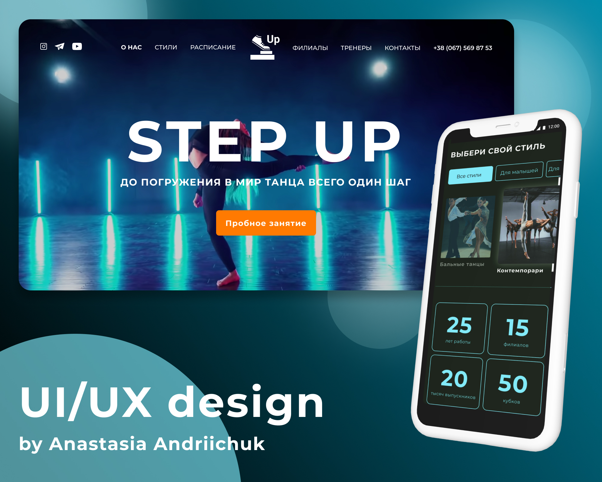
Landing Page
I created Landing Page design for Dance Studio Step Up. I chose dark colors so as not to overload the users' eyesight. The main colors are turquoise shades, as they convey something modern. The Landing Page consists of 17 sections.

Landing Page
I created Landing Page design for Dance Studio Step Up. I chose dark colors so as not to overload the users' eyesight. The main colors are turquoise shades, as they convey something modern. The Landing Page consists of 17 sections.
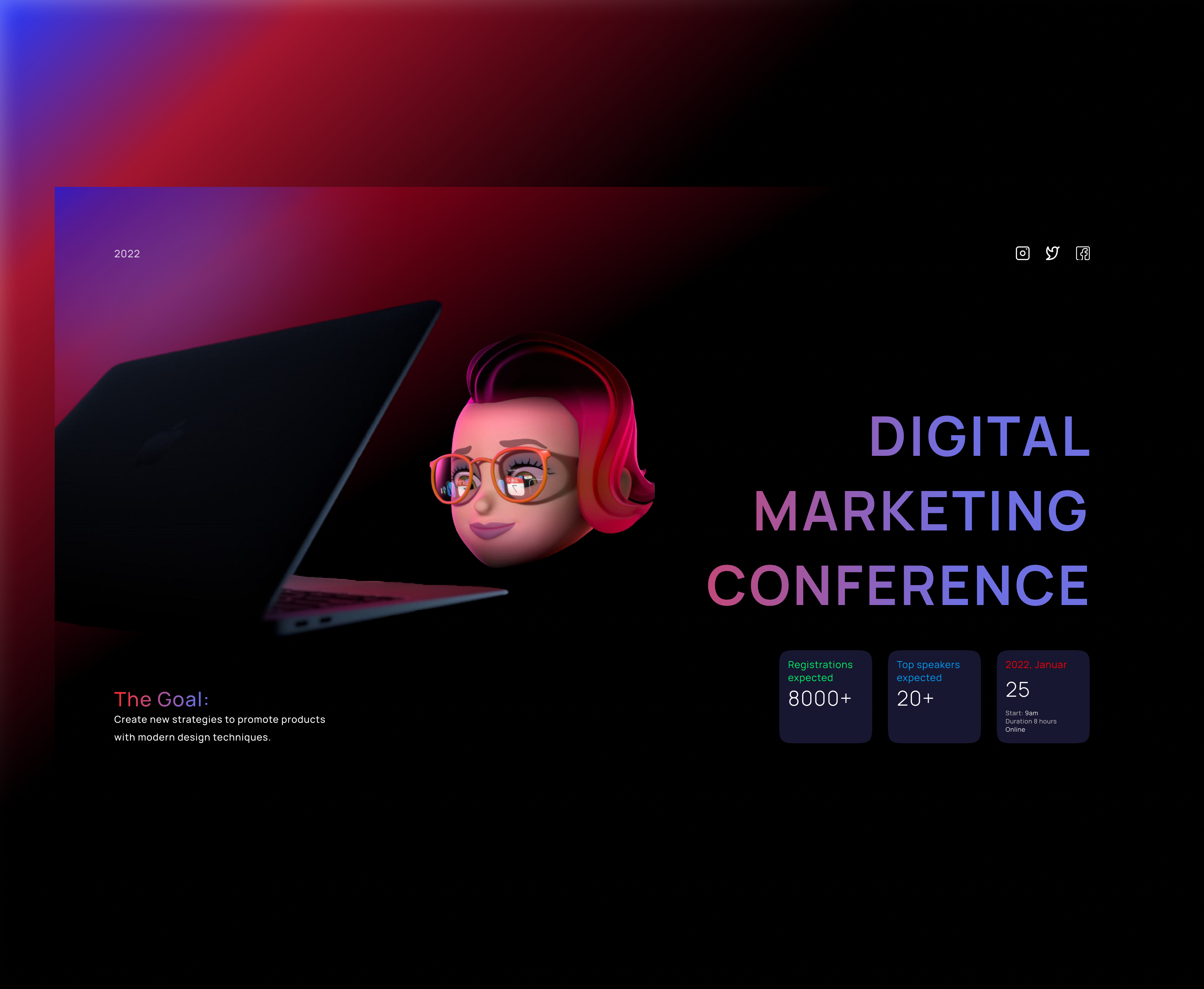
Digital marketing conference
I've created a banner for digital marketing conference. I choose such dark colours not to overload the eyes.

Digital marketing conference
I've created a banner for digital marketing conference. I choose such dark colours not to overload the eyes.