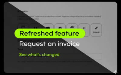
A new Useme with a more user-friendly website and the new visual identity reflects our voice. We are excited to announce a new Useme—a safer, more user-friendly. Useme was found in 2014. At that time, our founder intended to solve one problem. He wanted to make the process easier for employers to work with individuals.
Time to reveal the new chapter of us. Useme has stood with more companies, individuals, and remote workers. We have more abilities and responsibilities than before. Our site should align with our growth for your needs.
The reason behind
Useme takes users as the top priority. That is the reason for making these changes. We have received several opinions from our followers like “the portal was built from a programmer,” “Not user-friendly to find the function in the first place” We hear the voice and decide to provide a better experience. We upgrade the overall structure instead of renovating the current website.
The process for fulfilling this call
The first step starts with reviewing all of the feedback from our users. Meanwhile, our marketing team also sends a yearly survey with additional questions about better service recommendations. Since the work involves several aspects, we also consult with several professionals to build a better Useme. The new website’s structure comes from our users, the whole Useme team, and external professional support. By working together on this project, we realize the impact and extra revision. Our visual identity must reflect our present vibe. As we have grown 411.05% within the last 3 years and more than 100k users join us. That is the reason for adjusting the visual identity during the process.
The achievements
The renovation takes more time and resources than expected. We test every function, consult with professionals, and modify the details accordingly. The IT department spends hundreds of hours adjusting every code. Our new website has a higher security level and faster speed than before. With the new layout, sending an invoice is so simple that even your pet can do it. You can enjoy the advanced site and work the way you want. Meanwhile, we will provide more functions piece by piece over time.
The new Useme
Useme has grown much more than before. We exceed the limitation and work with a lot of talented individuals. Now we recognize our central core as a connector. A person who stands in the middle so both sides cooperate smoothly regardless of any boundary.
Here is a quick peek at the new Useme. It preserves all of the precious from the past and makes it easier. As promised before, Useme becomes more accessible for your needs. All of the functions and data remain the same. We achieve our goal, but this is not our finish line. Stay tuned for more functions in the future.


